With this project, we were tasked with creating a retail bag for a brand using water color. I chose Prospero’s Books and Media. I was inspired by the writing that covers the shelves and the tall stacks of books throughout the store. After making the bags, I expanded the project to rebrand their social media as well. Since they are a locally owned business it seemed the most practical to have them utilize social media as a way of reaching new audiences, because it is less costly than other forms of advertisement.
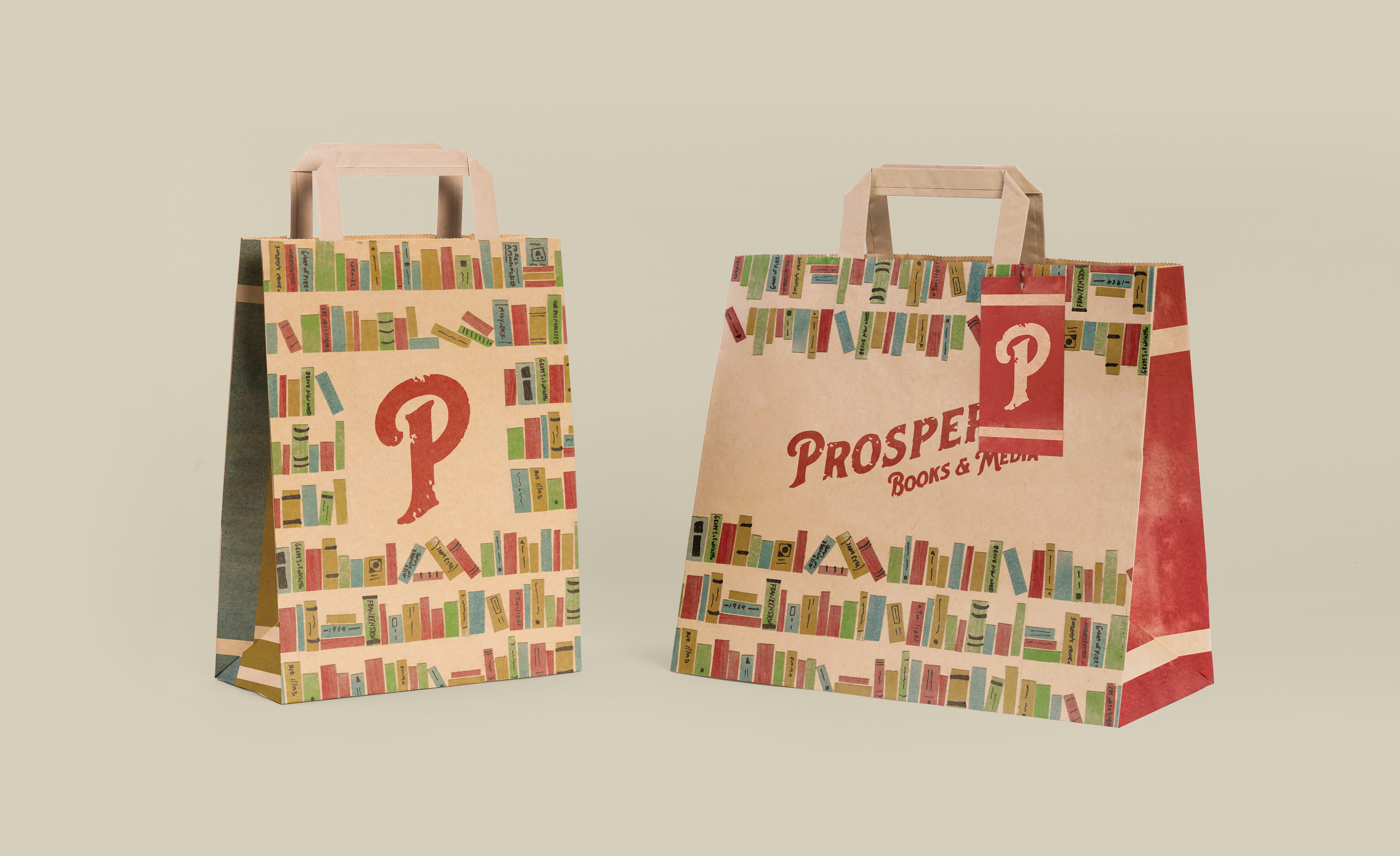
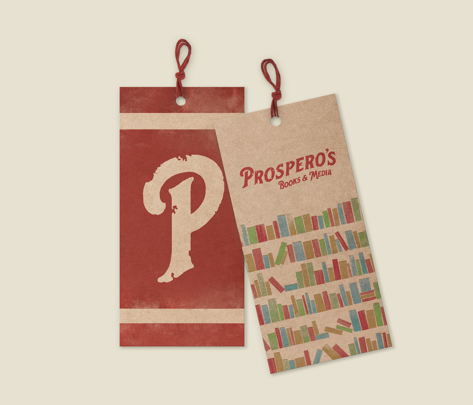
For Prospero's bags, I chose a Kraft paper bag because I wanted the brand to feel friendly and approachable. On the bags are shelves of books that are made from watercolor and cut paper. Overlapping the books are doodles of book names and simple lines. I wanted to give the bag the feeling you get when you enter the store, which is why I incorporated the doodles onto the bag.
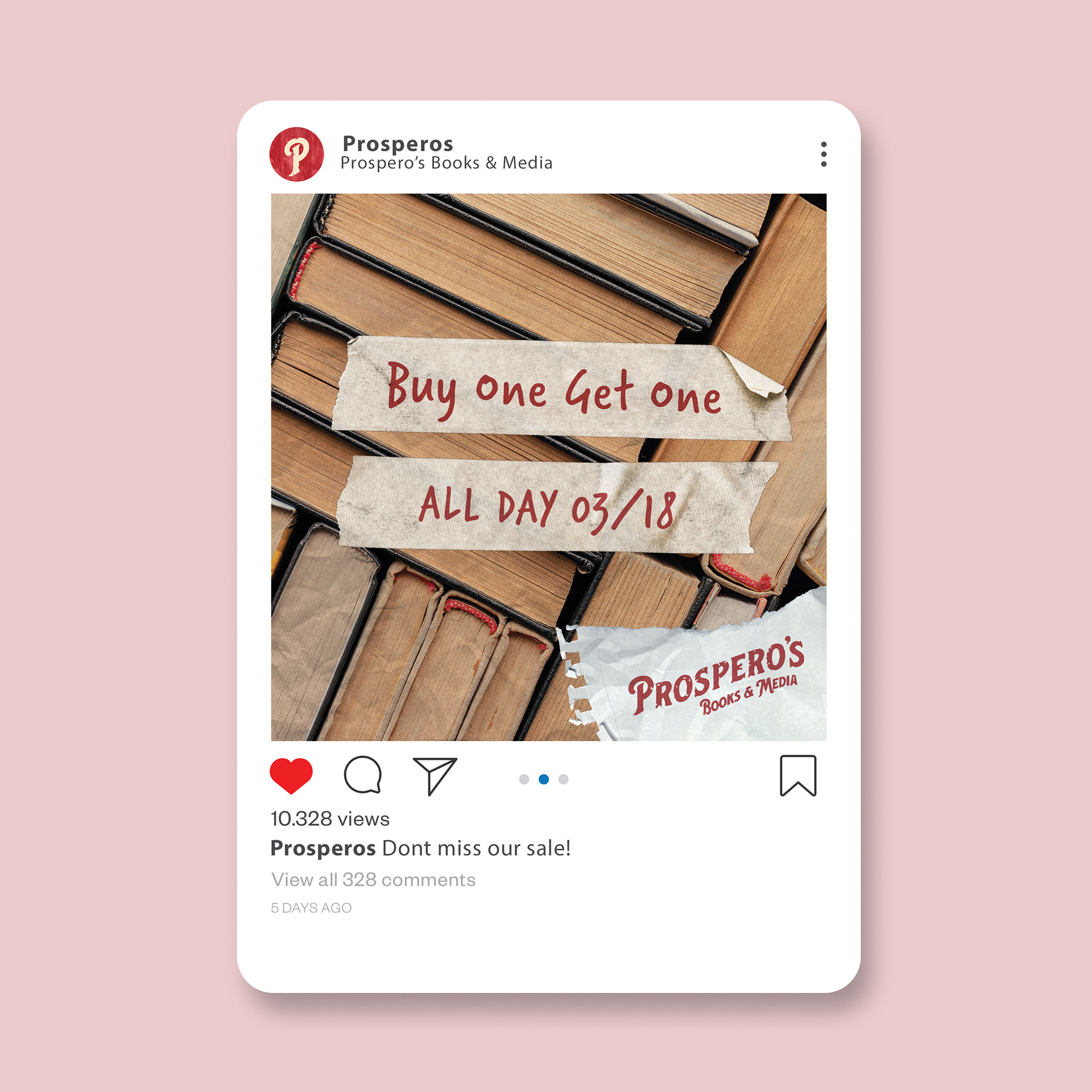
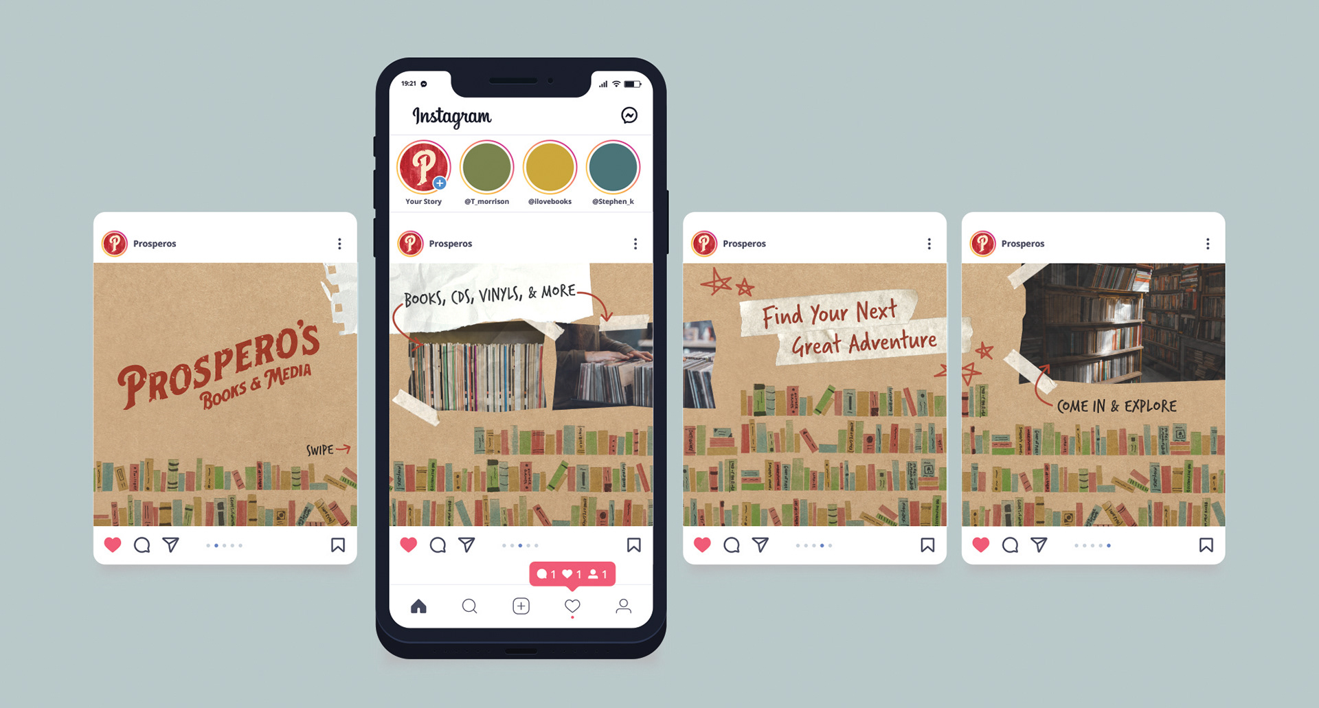
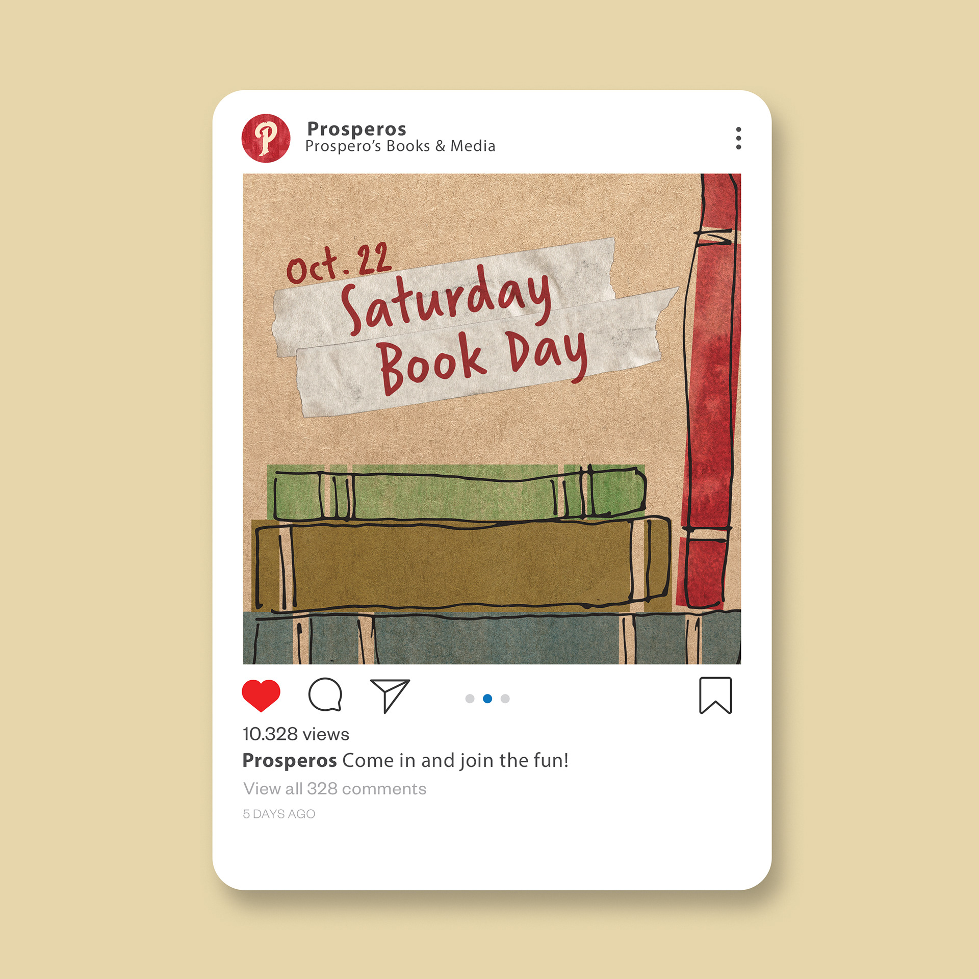
For Prospero's social media posts, I wanted to make them look like scrapbooks. The design is made to look friendly and familiar, to match how the store feels when you go in. I also kept the posts cohesive without making them too similar to make them more visually interesting when someone looks at their profile.
