One word we hear a lot in school is “process.” Teachers stress the importance of showcasing our creative process and recognizing its significance in our designs. With this in mind, I decided to center my showcase theme around the word “process.” My goal was to capture the design process and bring it to life in a stylized way that could represent each of the graduating designers. I utilized various design elements such as handwritten text, torn pages, sketches from past projects, and a vibrant yet grounded color palette to visually depict the design process in a unique and engaging manner
Spot varnish was used on all of the black, handwritten text to make it look like marker. We did not want to overdue the varnish and so we kept it simple to keep with the deconstructed look of the showcase branding.
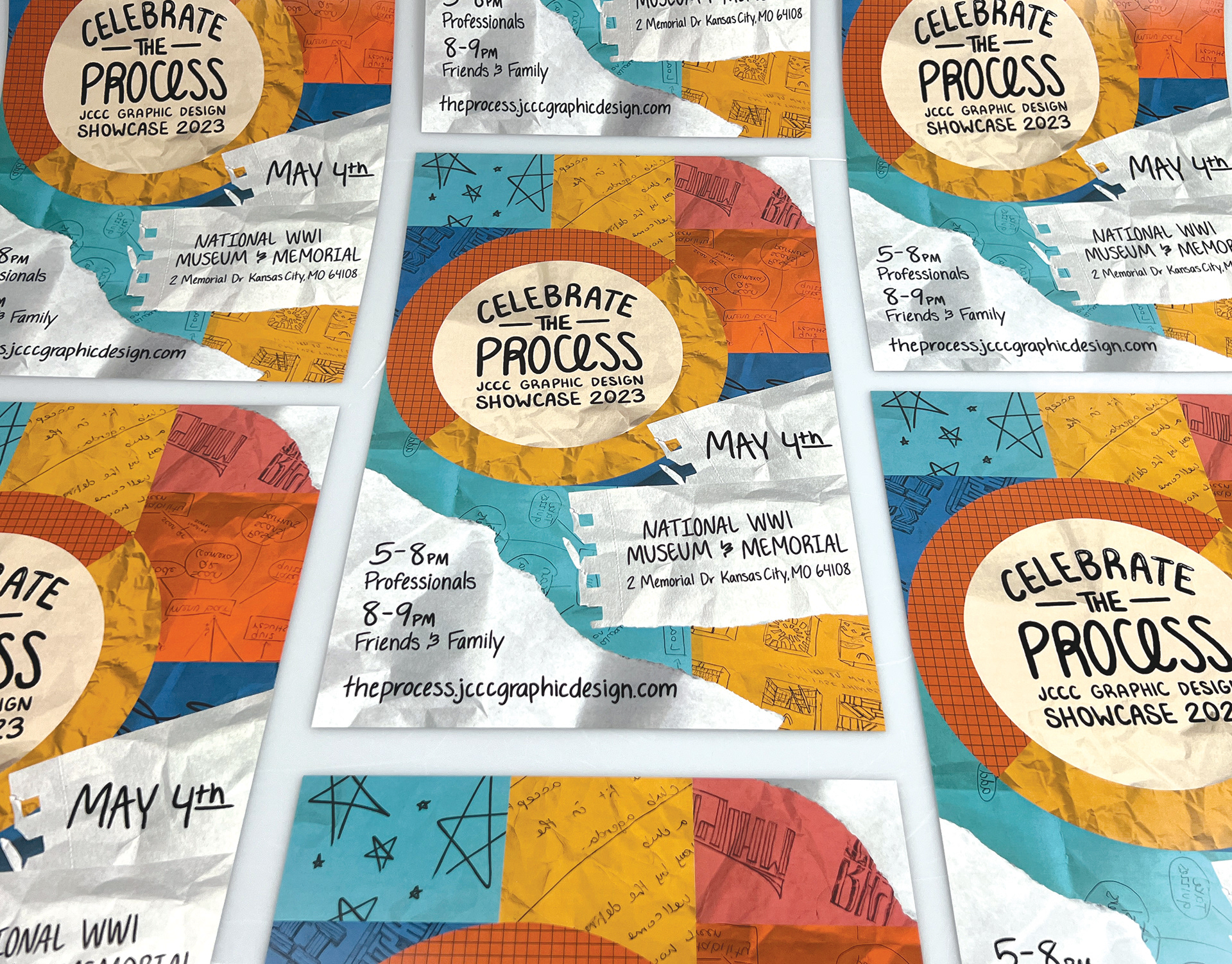
Posters made for the showcase
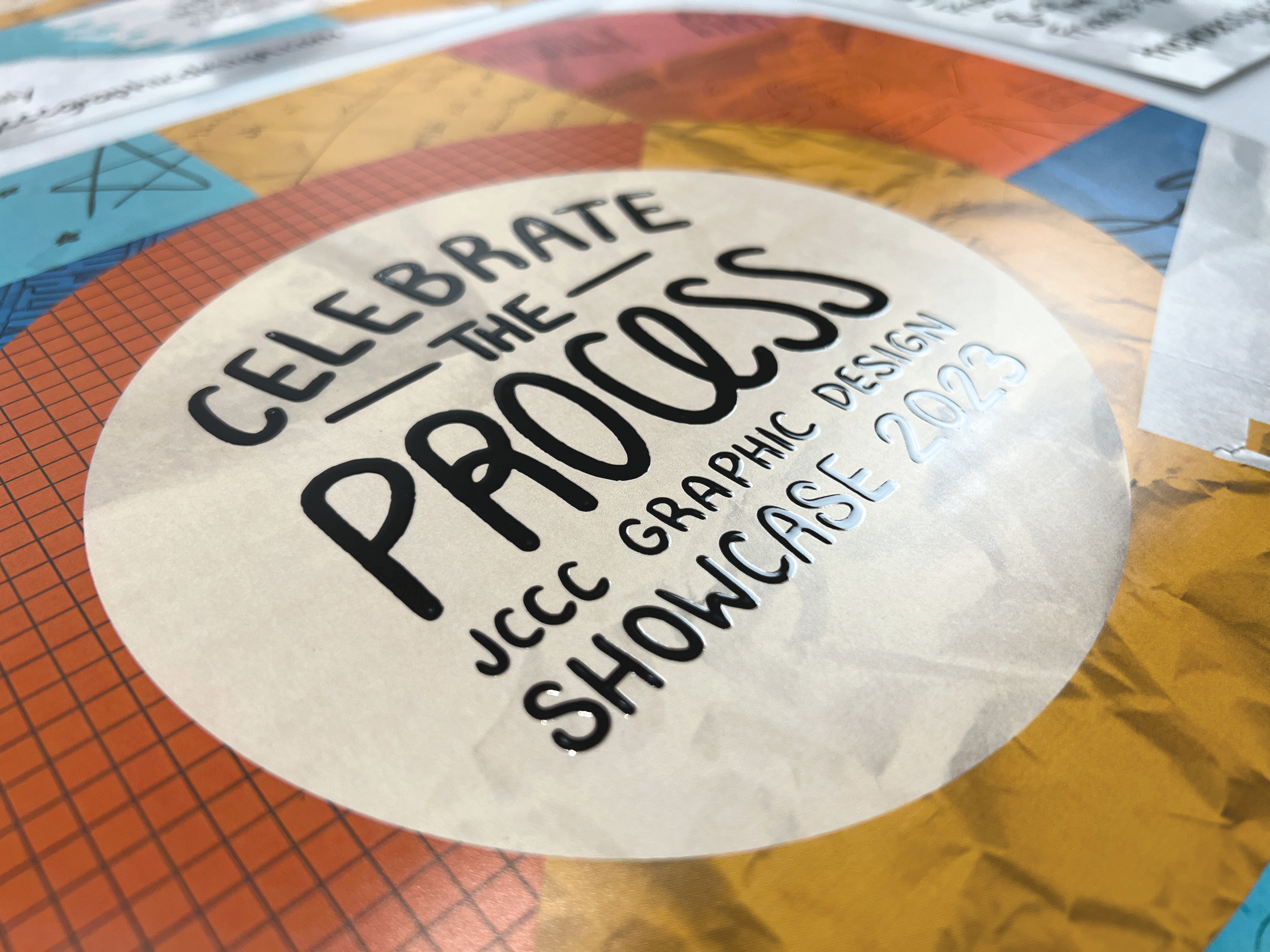
Close-up of wordmark.
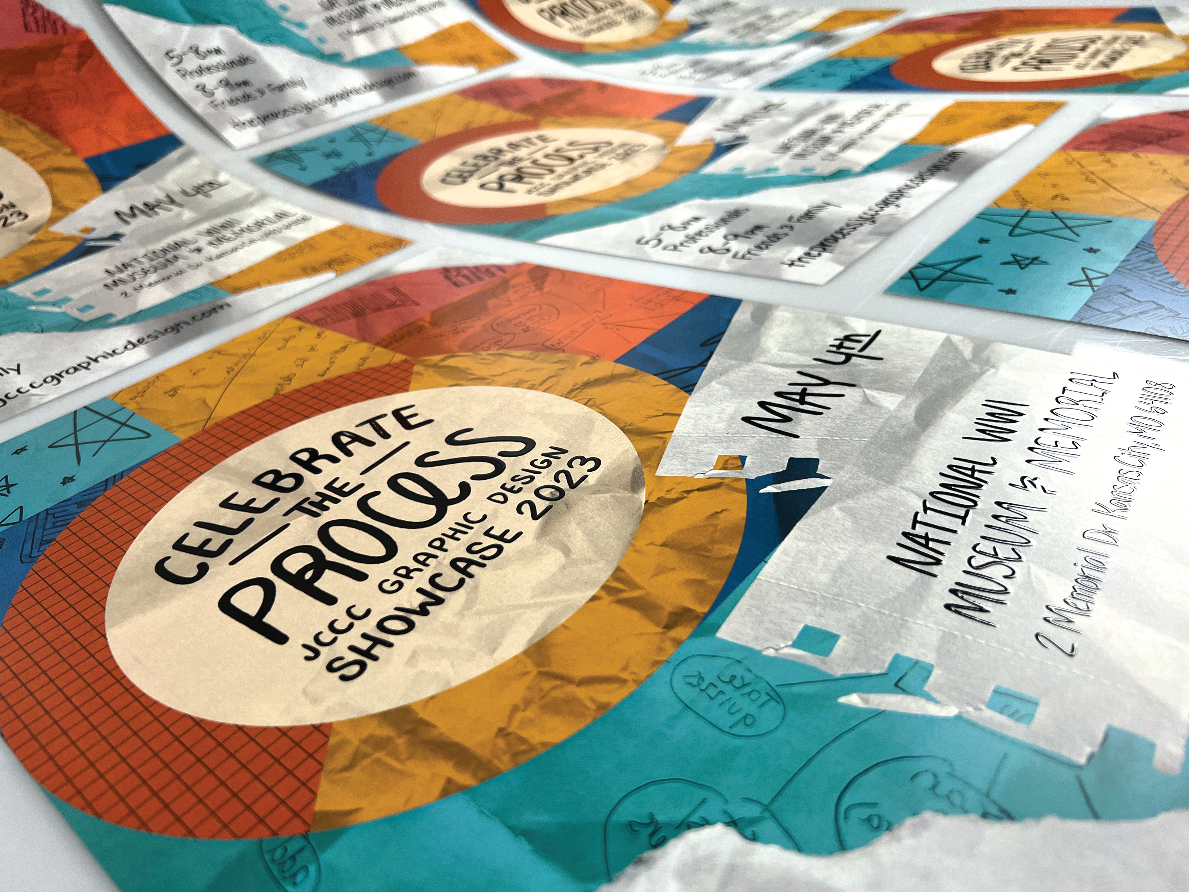
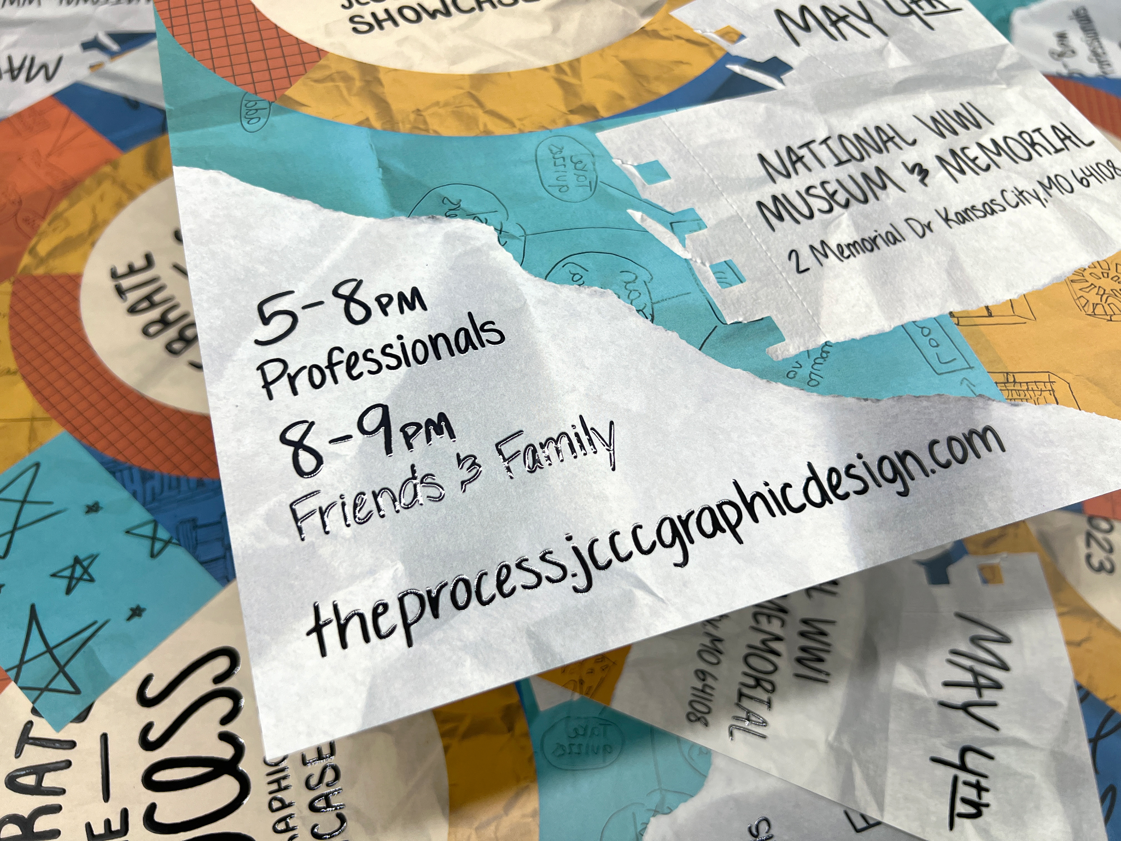
Close-up of handwritten type and the spot varnish on it
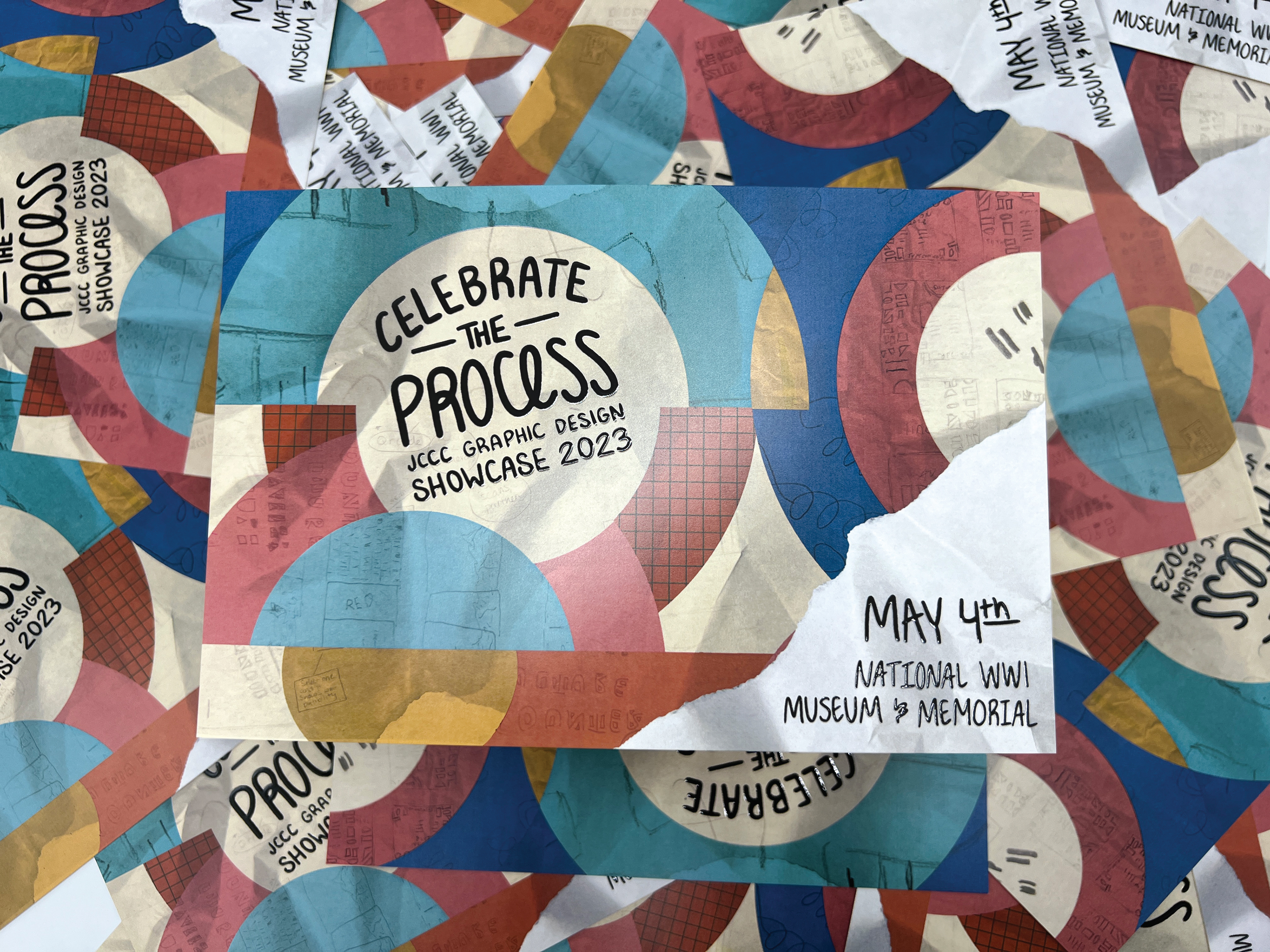
Postcards made for the showcase
For the showcase social media pages we wanted to keep the look and feel the same as the our print promotion pieces. When we made our photos highlighting the designers we wanted to keep it playful and on theme, so we place doodles onto each photo.

